(2000—2002)
My role: Lead Designer, Illustrator
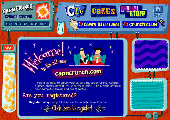
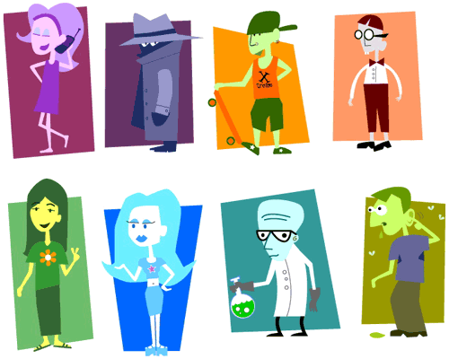
Cap’n Crunch is a beloved staple for the under-seven crowd. Quaker Oats wanted to bring an older cereal-eating crowd (eight- to twelve-year-olds) into their market. I helped craft a customizable website loaded with games and graphics, and created several more realistic characters to populate that website. The visual style drew upon classic Jay Ward cartoons, appealing to young and slightly-less-young alike. Flash elements were sprinkled across the interface, lending it a whimsical, sproinging quality.

Characters for CapnCrunch.com

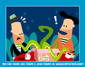
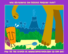
Animated Flash E-Cards

